

RESTAURANT BRAND
GUIDELINES
In this academic assignment, I was required to develop a business system and brand guidelines for a fictional restaurant. The restaurant is called Pantry Provisions and its main draw is that customers cook a meal hotpot style using staple ingredients commonly found in the pantry.
STYLE GUIDE
The branding style guide details all of the aesthetic aspects that make
Pantry Provisions presented the way that it is.
Cover Page Stack

Intro Spread

Colors Spread

Typography Spread
Cover Page

Table of Contents

Intro Transition Page

Mission Statement

Logo Transition Page

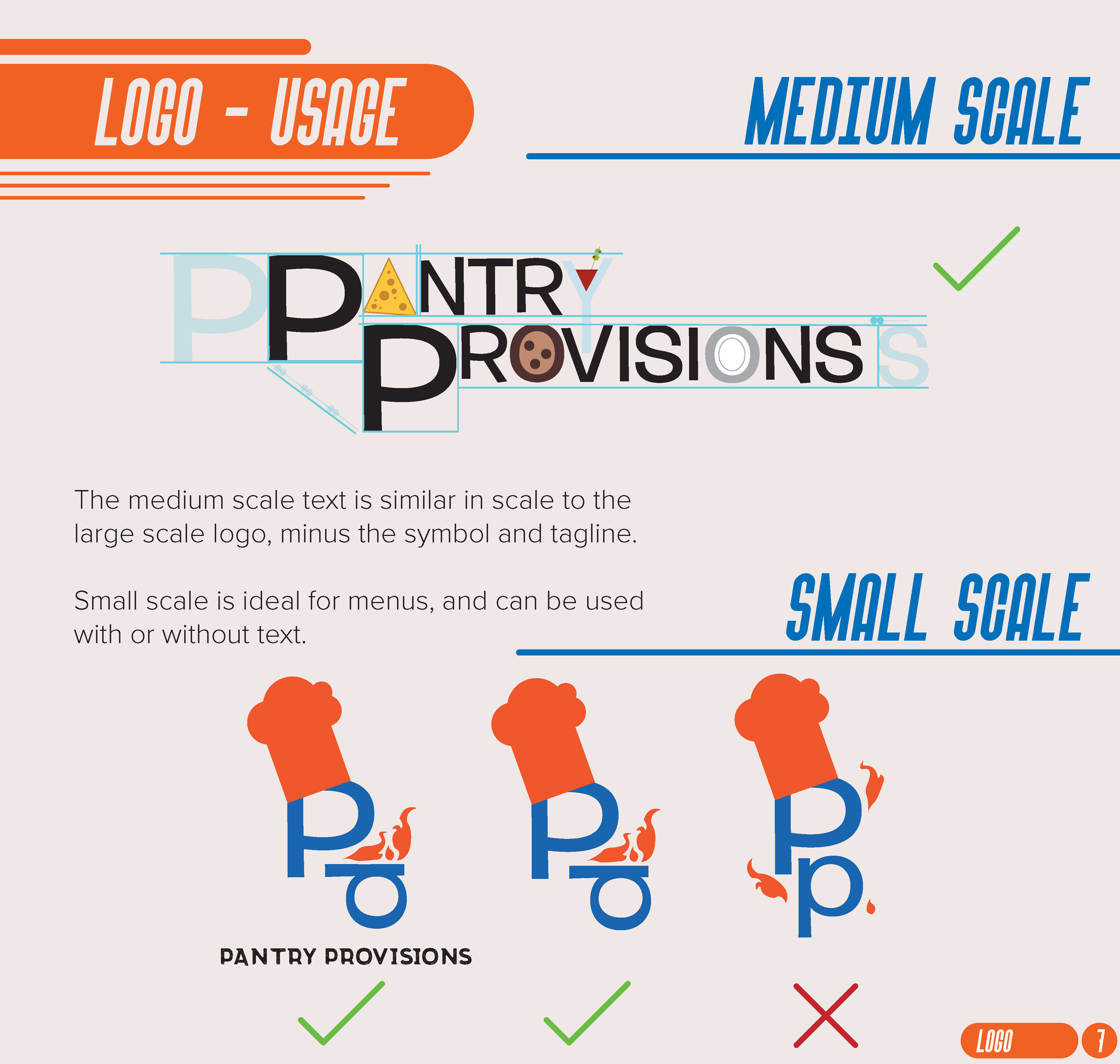
Logo Lockup

Logo in Use
Logo in Use 2

Colors Transition Page

Brand Colors

Brand Palate

Typography Transition Page

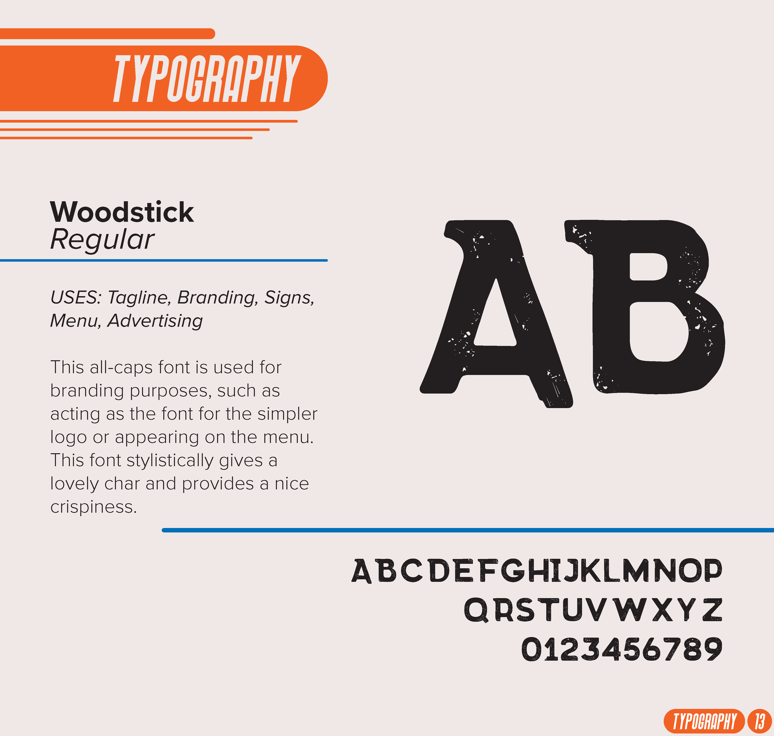
Typography Page 1
Typography Page 2

Typography Page 3

Typography Page 4

Typography Page 5

In Use Transitional Page

Logos In Use

Billboards in Use

Storefronts / Signage in Use

Menu and Coasters in Use

Business and Stationery in Use

Business and Stationery in Use 2

To Go Packaging in Use

Social Media in Use

Thank You Page


The concept for Pantry Provisions is a hotpot style restaurant where customers have a limited assortment of ingredients to choose from but have to cook it themselves. The audience the restaurant appeals to are mainly families and young people on a budget. The menu is affordable to most and is unique due to the limited rotating selection of fresh ingredients and the requirement to cook makes the experience different every time.
The purpose of the restaurant is to erase the negativity surrounding “ingredient households” by using said ingredients to make traditional yet modern meals that bring everyone together at the table.
case study
Initial ideas for the restaurant project included Comatose Cafe, a restaurant serving heavy meals that would make you want to take a nap, and Cheap Chomps, serving extremely cheap food that ignores quality for quantity. But I eventually settled on Pantry Provisions because it showed a lot of potential growth as an idea. Restaurants where the customer cooks are common, but using predetermined nonperishable ingredients seemed like an interesting concept to develop further.
There are three key goals I wanted to achieve with the identity of Pantry Provisions:
Casual dining, with a twist
Simple recipes / Approachable to all
Memorable / Make memories with friends and family
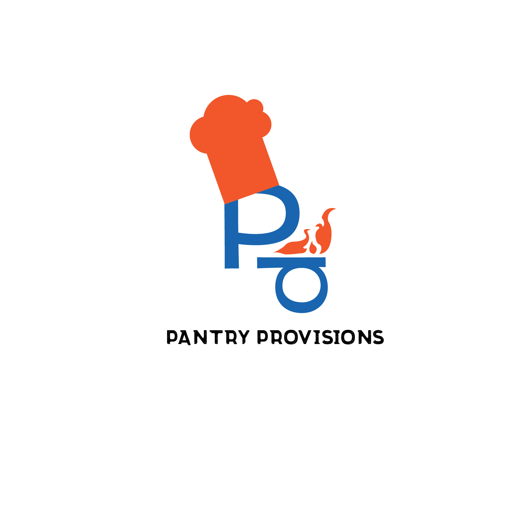
LOGOS
The logos represent the excitement that comes from cooking meals. From the beginning, I wanted the chef hat to play a key part in the restaurant branding in order to evoke the belief that anyone could cook, even if they are lacking in experience.
When designing the menu for Pantry Provisions, I wanted the design to feel like a cluttered pantry while also making it easy to understand. Since the restaurant is random in nature in terms of the available ingredients, you can select a protein but then everything else is randomized. That’s part of the fun of Pantry Provisions, you’ll never know what you’ll get.
MENU DESIGN


collateral assets
It was just as important to visualize the restaurant itself. Developing the brand identity for the restaurant proved challenging as each individual part had to be able to not only stand on its own, but also go together with everything else. A simple color palette was developed to represent the warm sense of community found at the dinner table.

sIGNAGE


stationary


TO-GO & CATERING


MERCH


EXTRA


Pantry Provisions encourages customers to “use up what they got”, making sure that no food is wasted. The same principles are adhered throughout the overall brand identity for the restaurant. The randomized ingredient concept allowed me to think outside of the box and take into consideration how sharing meals at the dinner table can bring people together. Overall, I am most proud with how the menu design and style guide turned out. I believe those two sections best represent Pantry Provisions’ identity as a whole.